17 Jun
Checkout pages are a series of pages that shoppers see once they click the “checkout” button on either the cart page, a “mini cart” popup-style cart or inline Ajax-powered “added to cart” confirmation message.
Previously, the URL would change to the checkout.shopify.com subdomain, but Shopify thankfully changed this so that users stay on your domain name once the checkout process starts.
Subscribers to the Shopify Plus enterprise level service have advanced capabilities to edit the checkout pages, but most Shopify users will not. You can use the secure Shopify checkout to accept orders and take payments wherever you sell online.
What is a checkout page?
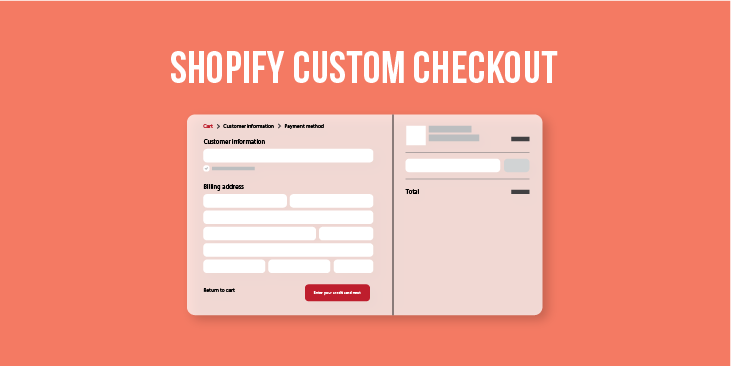
The checkout process is the process that a customer must go through when checking out the items in the cart. This is what the user sees at the frontend. When a customer wants to check out the items in the shopping cart, the following process must be completed:
- The checkout process starts when the customer clicks the checkout button in the Shopping Cart or the Shopping Cart Summary, or the Buy Now button.
- If you do not allow anonymous shopping, a user who is not logged in will be taken to the specified login page. For more information about configuring anonymous shopping and login pages, see Checkout widget.
- The Shipping address fields appear. If the user is a returning customer the shipping address will appear prefilled with the information that was last specified by the user.
NOTE: The country selected by default is the country that you configure in the Administration: Store settings. - If the billing address differs from the shipping one, the user must deselect the Billing address is the same as the shipping address checkbox.
The Billing address fields appear. - Clicking Continue takes the user to the next step of choosing a shipping method.
All Overview: Shipping methods that you have defined for the customer’s location appear in a radio button group.
The widget also displays the Order summary.
Displays the current order, the Overview: Taxes and tax classes and the Overview: Discounts and Coupons that apply to the subtotal. - Clicking Continue takes the user to the next step of choosing how to pay for the items.
All Overview: Payments methods that you have defined appear in a radio button group.
If the user chooses to pay with a credit card, the following fields must be completed:
- The card type
- Card number
- The system automatically validated the card number
- The Cardholder name
- The Expiration date
- The Security code
NOTE: Payment options are not displayed when the order’s total is zero. In this case, the Payment step only notifies the user that the order is Free.
- If a coupon code for a discount has not been applied through the shopping cart, Have a coupon code? field appears after the payment details. The user can use the field to apply an overview: Discounts and Coupons to the subtotal.
- Clicking Continue takes the user to the next step of previewing the order details, the shipping and payment methods.
- The user must confirm by clicking Place this order button.
The order is confirmed, the confirmation page is displayed to the user, and an email is sent by the store to the customer.

Customizing the style of your checkout
If you sell your products using an online store, then you can customize the style of your checkout pages in the theme editor. Add your company logo, change the colors, or choose a new font to make the checkout match your business.
Although you might want to add a lot of color and interest to your checkout pages, it’s best to keep the design simple. Your customers use these pages to enter shipping and payment information for their orders, and you don’t want to distract them or make the information hard to read. Choose colors with high contrast, and images that don’t draw attention from the words on the page.
Why the Shopify checkout page limitations?
First, it’s important to understand some of Shopify’s reasons for implementing this restriction in the first place. An obvious one is that making a custom checkout page a premium feature makes Shopify Plus more attractive to merchants for whom a completely branded site or bespoke end-to-end user experience is important.
There are some practical reasons for this limitation, too, though. Because Shopify is a subscription service, a proprietary platform on which thousands of websites are built, it must comply with a vast array of different security, accessibility, and other regulations. Having a common checkout page on most of its stores streamlines development and maintenance for Shopify and, again, justifies making heavy customization a premium feature.
Additionally, the truth is that however else you customize your ecommerce site’s user experience, once the user lands on the checkout page, the only goal as a merchant is for the user to complete their checkout.
Most ecommerce sites don’t require reinventing the wheel of the checkout experience; there are certain tried-and-true elements that help drive conversion rates. Indeed, because Shopify hosts so many sites with a common checkout page template, it has been able to optimize the design for conversion. So, a limitation from one angle begins to look like a selling point from another.
What you can control on Shopify checkout pages
While the basic layout of the Shopify checkout, as outlined above, can’t be changed, you do have some control over how the checkout looks.
- Banner image: Here you can upload a custom image that reflects your brand. In general, a 1000 by 400 pixel image is recommended. Since the image could become cropped based on the screen size of a customer’s device, it’s a good idea to avoid images that contain text or any images that may look awkward if they become cut off.
- Logo: Here is your chance to include your brand’s primary element. Make sure your logo is clear and easy to see. Some store owners use this position to include a tagline, slogan or other messaging here. While this can be a good strategy, be sure to test how this looks and reads at all sizes.
- Logo size: This option lets you select how big the logo is. Since “small” and “large” are somewhat arbitrary, it’s a good idea to test this setting as well.
- Main content area background image: This image appears behind the main content area on the left and is another chance to integrate your look and feel. Keep in mind that form fields appear on top of this, so the image should be kept simple. This image will repeat both vertically and horizontally, so tiled options work better.
- Background color: Select the background color for the left column if you don’t have a background image. In general, using a solid background color is a safer, cleaner way to go for checkout pages, unless you have a subtle pattern or texture that matches your brand.
- Form fields: You can choose either white or transparent.
- Order summary background image: You also have an option to include a background image behind the order summary column. Remember, keeping this image light and simple is best.
- Background color: Select the background color of the order summary area if a background image is not used.
- Typography: You can choose the font for all headings and all body copy in the checkout. Unfortunately, there’s a limited number of fonts that can be used, unlike the advanced Shopify font picker.
- Accent color: This color is used for links, highlights, and checkmarks in the checkout area. Pick a color that’s prominent in your brand and contrasts with any background images or colors.
- Button color: The background color of the gift card, discount, and next step buttons. For legibility purposes, this color should be bold and high contrast.
- Errors color: This color is for warnings and invalid field errors which should also be prominent. Red is a common option, but if you’re using a dark background, it can be difficult to read.
- You can also control a variety of settings under Settings > Checkout, such as extra form options.
You can also control what text is shown in most areas of the checkout using these tips. The best way for making the checkout process match your brand are the banner, color options, and logo, so take advantage of these.
As with anything in Shopify, it’s always a good idea to test how your checkout looks on all devices for any issues that might cause a customer to abandon the checkout.
What you can’t control in Shopify checkout
Outside of the list above, making additional customizations to the checkout would require advanced development. Here’s an overview of some common things that you can’t change within the settings:
- The general layout or structure of the page.
- Additional elements to the header or content areas such as logos, trustmarks, banners, promotional images or text.
- The process, or what fields are required to complete the checkout.
- Switching to a “single page” checkout.
- How the “order summary” panel behaves on mobile.
- Moving the gift card or discount code input box (or most other fields). If you’re concerned about customers forgetting to add discount codes, consider using discount URLs.
- Adding your site’s full header with navigation.
Why is the Shopify checkout so limited?
So, why does Shopify restrict the layout of the checkout pages so much?
- Since checkout forms collect sensitive personal and payment information, there are certain legal or compliance reasons that Shopify needs to maintain tighter control over how these pages look and function.
- By “locking down” much of the checkout pages, Shopify is also protecting you from third-party apps or malicious code injections that might compromise the security of your site and open you up to substantial liability.
- Every day, this general layout is used across thousands of checkouts. Shopify occasionally experiments with different options on random checkouts, but in order for changes to be integrated across every Shopify store, they have to prove to be significantly more likely to convert. However, this happens very rarely.
- Because of this, you have the advantage of being able to use the best practices for checkout pages that have resulted in billions of dollars in sales across millions of shopping sessions.
- Getting enough traffic to test alternative checkout layouts would only be possible for extremely high volume stores.
- Shopify has also carefully designed its checkout pages to minimize distractions and make the customer focus on completing a purchase. For this reason, while you can keep your brand in the header, it’s not possible to have other elements included.

Why doesn’t Shopify have a single page checkout?
One of the most common requests from Shopify store owners is the ability to have a single page checkout. This feature is found in some other e-commerce solutions.
- The data over whether a single page checkout increases conversions is debatable.
- To this date, Shopify’s testing and analysis of millions of checkouts have not shown that a single page checkout would improve conversions.
- Shopify has included numerous features, such as advanced autocomplete for addresses and subtle animations designed to make the checkout process fast and efficient.
- When loading the payment information fields, Shopify thoughtfully uses “loading” animation effects to make the page seem more “active” and “dynamic.”
- Single page checkout solutions on non-Shopify platforms often still require the customer to wait briefly for additional information or content to load when proceeding through each step, so this is essentially becoming the same process Shopify customers see when checking out.
While Shopify doesn’t offer a single page checkout by default per se, it does leverage many of its features which results in a similar experience.
How is the Shopify checkout page optimized for conversion?
The Shopify checkout page ticks a lot of the elements that make for a high-converting user interface. A few of the most important ones are:
- A single, clear call to action
- A logically organized layout, with related functions grouped and a clear hierarchy of information
- Signposts that orient the user within their current workflow
1. Clear Call to Action (CTA)
The “Continue to shipping” call to action is the most visually striking element on the page. If there is one available action the user will see, it’s the big blue “Continue to shipping” button, which will help ensure the user is propelled forward in the checkout process. “Return to cart” is available, since Shopify is not completely draconian about isolating the checkout pages from the rest of the site, but it is nonetheless minimized.
2. Logically Organized Layout
Making the “Continue to shipping” button is one example of Shopify’s designers inserting information hierarchy into the checkout page layout. Beyond the primary call to action, the layout is organized in a logical way, with the position and visual attributes of its various elements both determined by and reflecting their relative importance, as well as their relationships to each other.
For example, the main visual division in the layout is a result of the designers separating the inputs and the outputs. The information the cart outputs (e.g., shipping price, taxes, total cost) will be affected by the information the user inputs as they enter their address, shipping preferences, and payment method, but these changes will be easy to see because the outputs are grouped together and their position on screen remains consistent from page to page as the user moves forward in the checkout process.
3. Orienting the User in the Workflow
One of the most important axioms in UI and UX design is that the user should never feel lost. In the context of an ecommerce site, the user should always know where they are in the site as they move from the home page to the product listing or product category page, to the product detail page, and onward through the checkout. Once in the checkout process, the user should feel like they’ve moved away from the main site and have entered a one-way workflow.
This process potentially requires a lot of input from the user (assuming their shipping, payment, and other details aren’t already saved) and any level of frustration might lead them to abandon the checkout. That’s why it’s critical to keep the user oriented as they move through the checkout process; they shouldn’t feel like there are too many steps or like they don’t know how many pages are left before they can submit their order.
In this respect, Shopify has cut out any extraneous functionality to reduce “friction” in the checkout process, and additionally provides various signposts in the UI to orient the user.
Conclusion
While it can be seen as a drawback of the platform, in reality most ecommerce merchants, especially those drawn to Shopify in the first place, do not have functional needs not fulfilled by Shopify’s common checkout page.
Furthermore, because hundreds of thousands of online stores use the same checkout pages, Shopify has been able to analyze the UI and optimize it for conversion and that’s the most important aspect of a successful page design.