14 Jul
Conversion focused website design is one that gets your website visitors to engage with you by responding to your calls to action. For most firms, an ideal conversion means that person books a consultation with your firm or fills out a contact form.
This kind of a website will have one goal and every visual element and piece of information on the site will be dedicated to that goal. That includes using logos and photos that project your firm’s desired image, clear and concise web copy and a call to action on every page.
What is conversion focused web design?
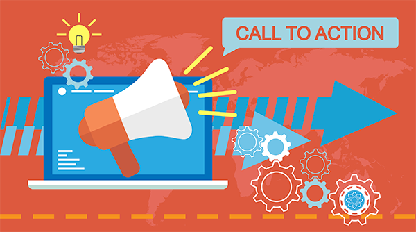
A conversion is an action taken by your website visitor in response to your call to action (CTA). And a call to action could be to make a purchase, sign up or subscribe to a newsletter, watch a video, or any other action you want your visitors to take.
When adopting conversion-based web design, calls to action become the core principle. The rest of your web design will focus on getting the user to respond to the call to action. This includes the layout, color, text, and images on your site.
Conversion-focused web development is a way of web development where every aspect is aiming for the highest conversion rates. This doesn’t only mean trying to obtain the highest ROI. It is all dependent on the goal of the website. A conversion could be someone who downloaded the ebook, brochure or any other kind of content. Let’s have a look at a funnel that is regularly used to analyze a website.
The funnel
This funnel describes all the stages from visitor to sales. In between every step you can calculate a conversion rate. The aim of a conversion-focused website is to achieve the highest possible conversion rates. In each phase of the funnel, there are different solutions. Those will be explained later in this article.
Now that we know what a conversion-focused website is, let’s have a look at the characteristics. On what elements of a web page does it differ from your regular developer in order to obtain more website conversions.
1. Knowing the target group by gathering data
Do we listen to your input? Data is the most important source for building a website. Data is objective (if you interpreted it right) and will tell us a lot of information about the target group. Data is obtained by using several methods like website analytics, heat mapping and A/B testing. If it’s the first time you hear about heatmaps, then I recommend you to read this.
2. Analyzing
There are hundreds of performance indicators which will tell you the behavior of the target group. Data on its own won’t help you. Analyzing and drawing conclusions based on the data is just as important. Otherwise, you can’t really understand the needs of your target group.
For instance, a page could be not converting enough. This doesn’t mean that the page is bad and it needs a completely different design. The problem might be the content, the CTA button or a technical issue. You need to combine the data and place yourself in the shoes of your prospects in order to draw the right conclusions.
Earlier in the article we saw a website funnel. With this funnel we can analyze the area in which your website can improve the most. For instance; The website is not achieving the required number of visitors. Perhaps the content is not interesting enough. You could also consider inserting a social media button that people can use to easily share the content.
If the most problematic area is that people are not downloading the content, then it might be better to optimize your website with better CTA’s and review the form they have to fill out before downloading that piece of content.

3. Optimizing
After you have drawn the right conclusions, you can fix the issues that your prospects are experiencing. This can be anything from small changes like a color change in the call to action button to a completely new website design because to have a better user experience.The most important strategies are:
i. User experience
By optimizing the user experience, people will experience the site as pleasant. With conversion-focused web development, A/B testing could be important to effectively test user experience. With A/B testing you create two versions of a website element (Version A and version B) and test them with your audience (the website visitor). The one with the best results stays. The important thing about testing is, don’t change too much at the same time. When you test more or bigger parts, you might not know what changed caused the difference in data. There is much more when it comes to A/B testing. A good blog about A/B testing can be found here.
ii. Valuable content that converts
Of course, who would visit your website (and return) when there is no valuable content. There has to be an incentive for prospects to convert. Providing your prospects with valuable information is the way to attract them to the website in the first place. Content also plays a role in website conversion. If prospects are impressed and think the content is helpful, they will use the CTA button more often. This is very important for sites who just want to inform as their main goal.
iii. CTA buttons
CTA buttons stand for call to action buttons. This means that this button is trying to induce a visitor’s action. CTA buttons are the single most important tools when it comes to website conversions. When doing conversion-focused web development you want to implement enough CTA buttons to make it easier for visitors to execute the action you want them to complete. A button should be inviting. Usually this is done by having an inviting text, a color that is in contrast with the web page and the shape and size of the CTA button.
Please note that you can’t just think; Let’s add some more CTA buttons to increase conversions. This will lead to a CTA overload which will decrease your click-through-rate (CTR) drastically.
Why is conversion-focused web design important?
Many website owners set out to create an amazing-looking website. The catch here is that what looks great to you may not look great to someone else. Everyone has their own tastes and preferences.
Instead, design experts have studied what works with the public in general. The findings rely on irrefutable data and scientific explanations as to why people respond a certain way to a color or a specific layout.
For instance, you’ll notice that most websites follow the same layout. There’s a navigational menu on the top, followed by the copy, and a call to action right in front. And most websites also include trust badges or anything that’s relevant to their site.
And here is why do the majority of websites and ready-made web design templates follow the same pattern?
It’s to keep things simple for the user.
People are familiar with this layout, and it’s easy for them to find what they’re looking for. If you try to reinvent the wheel and place everything in different corners of your site, this will lead to customers searching longer to get what they want.
And chances are they’ll leave your site before they do. So clearly, design matters. When creating or updating your site, it’s so important to consider what every element is designed to do.
Once you adopt a conversion-first approach, you’ll never go back. With the right design, your website will promote itself and get better conversion rates and sales. Now let’s look at the ways to improve your website conversion, along with some great examples for each tip.

Web design tips to improve conversions
Let’s discuss some core conversion-optimized design tips which will help you improve conversions on your site.
Tip 1: Keep important elements above the fold
The first important tip to increase your website conversion is keeping important elements above the fold. Above the fold is the content that appears on the screen when a page first loads. Below the fold appears after a person starts scrolling.
Whereas, the fold will depend on the device you’re using as well as the dimensions of your screen. This means that the fold is different for a smartphone screen, a laptop screen, and a tablet screen.
Moreover, always keep in mind that your website’s important elements should be displayed above the fold, and this should happen across all different devices and screen sizes.
Tip 2: Be consistent with your message
Another way to improve your website conversion through design is by being consistent with your messaging.
For example: The headline of a website’s homepage reads “Make stunning Presentations” and the CTA button reads “Create your Presentation”. Similar keywords are peppered through the text as well. Here, presentation software is the main keyword which will help in page ranking organically.
This means that search engines value this page when people search for “presentation software”. In fact, when we did a Google search, it was the first result that showed up. Also, this will automatically drive more traffic to your site. And what’s better is that you’ll get free organic traffic that’s looking for exactly what you have to offer.
Tip 3: Make use of white space
People love to use every inch of their website but it’s important to leave some white space for breathing room. White space plays a much bigger role than you can imagine.
It removes distractions and draws focus to what’s important so you can increase conversions. Plus, it improves user experience (UX) by making it easy for the user to know where they’re supposed to look. Moreover, white space can be a great way for you to increase conversions by getting users to focus on elements that matter. Just make sure to use it wisely.
Tip 4: Make your call to action button stand out
Focus on highlighting your call to action (CTA). If your CTA is vague and unclear, your visitors won’t pay attention to it. They’ll be less likely to take action. Instead, you need to get straight to the point and highlight it so that it stands out from the rest of the page. There are 3 ways to do this:
- Choose the right color
- Make your CTA bigger than the rest of your content
- Use effective action words
CTA should be well-balanced meaning it should blend in with the page but still stands out from the rest of the elements. With the right use of color, strong and highlighted CTA can definitely draw the user’s attention and get better results.
Tip 5: Focus on users experience (UX)
When a user has a pleasant experience on your site, they’re more likely to come back. They may even tell their friends about it. But user experience plays a much bigger role in web design. Search engines like Google place the most importance on user experience. There are 4 major factors that play into UX:
1. Staying Relevant
Your content should match what you offer. If your content is all about organic products but you’re selling non-organic products, users will be misled. They won’t find what they’re actually looking for which leads to bad UX.
2. Being Accessible
Your website should be easy to navigate. As we mentioned earlier, it’s important for the users to be able to find what they’re looking for. If they have to go on a treasure hunt just to find a ‘sign up’ button, they’ll most likely leave before that happens.
3. Optimizing for Speed
Users expect a website to load in 3 seconds or less. That’s a really short span of time. The key to making this possible is using optimized images and minimalistic design. Stay clear of loading your website with large media files. Added to that, you can also use a caching plugin like WP Rocket to speed things up instantly.
4. Presenting Offers
How many times have you visited a website that bombarded you with popups? Too many offers and lead generation campaigns can put off users and they won’t take you up on any of them. Instead, you should target your offers and display them based on their interests and actions on your site.
Tip 6: Use a minimalistic design
Using a minimalistic design is one of the main characteristics of conversion-focused web design. It shows the user what the product does but in a minimalistic way. Make it simple, straightforward, and definitely optimized for conversions.
Web design tools to optimize conversions
You need design skills and coding knowledge to build a decent-looking website. But all that changed when developers created tools that make website building so much easier so anyone can build a website.
Plus, they’re created and backed by experts that know all about conversion optimization. So not only are they easy to use, but they also give you access to conversion-focused features.
1. SeedProd
It is the best landing page builder for WordPress. It comes with 150+ conversion-optimized templates so you can just pick a template and design your page in minutes.
You’ll find templates to build landing, sales, webinars, and even coming soon pages. Added to that, you can customize these templates easily using the drag and drop builder. If you don’t want to use a template, it also lets you create pages from scratch. And the best part is it has prebuilt sections. So you can build an optimized page faster and still get a unique design.
Every SeedProd template is responsive and mobile-friendly which means your site will look good on all devices. You won’t have to manually alter elements. Aside from these features, here’s where SeedProd can really help you optimize for conversions:
- Add optin forms to pages to collect contact info
- Track and manage subscribers
- Premium integrations with popular email marketing services like MailChimp, ActiveCampaign, ConvertKit, and Constant Contact.
- Enable coming soon and maintenance mode at the click of a button
- Built-in spam protection to block bots and fraud conversions
- Bloat-free pages which means they’ll load faster
2. OptinMonster
It’s one of the best conversion optimization tools on the market. You can use it to design different kinds of marketing campaigns on your site to boost conversions. It lets you build popups, floating bars, slide-ins, inline forms, gamified wheels, and much more. OptinMonster has powerful audience segmentation and targeting rules making it the #1 conversion tool in the world.
Moreover, OptinMonster even detects whether a user is a new visitor or a returning one. You can display campaigns according to how they’ve interacted with your site before. It has tons of targeting options to maximize your conversions. You can target visitors based on:
- Location
- Device
- scroll depth
- previous interaction with site
- previous interaction with OptinMonster campaign
- interest in products or pages
You can even get campaigns to open on click. Plus, there are many other targeting rules available to you. And setting up your optin campaigns couldn’t be easier. Also, you can choose from 9 different campaign types and 50+ templates, or start building from scratch. It also comes with a drag and drop builder to easily customize your designs.
Wrap up
Conversion-focused web design uses time-tested design principles and tricks to persuade users to take action on your site. By using psychological triggers, minimizing distractions, and optimizing for user experience, you can drive conversions and sales.
Also, when you combine SeedProd with OptinMonster, you’ll have everything you need to get the most conversions from your site. You’ll be able to skyrocket leads, sales, and conversions in no time.