28 Feb
Shopify has made it easier for people to establish, design, and run their ecommerce store. You don’t need to learn how to code or hire a web developer who costs a fortune. Getting users to check out your ecommerce store is challenging enough. But once they are already there, you have to convince them to buy.
When you design your store the right way, you can create a great first impression with site visitors, establish trust with prospects, and it lets you stand out from your competitors. In short, you will be in a great position to generate more sales.
But building a highly converting ecommerce site can still be challenging because it involves more than visual elements.
What is Shopify?
Shopify is an ecommerce platform that helps businesses run an online store. It offers a good alternative to opening brick and mortar stores to reach customers on a global level. It helps you increase both your sales and reach without experiencing the growing pains that come with outlet expansion.
With 99.98% uptime and a free SSL certificate, Shopify has you covered. Of course, you’ll need to choose your subscription level from these choices:
- Basic Shopify: Priced at $29/month, Basic Shopify allows two staff accounts, up to four locations, access to online marketplaces and social media, and unlimited products in your online store.
- Shopify: Priced at $79/month, the Shopify plan allows five staff accounts, up to five locations, access to online marketplaces and social media, and unlimited products.
- Advanced Shopify: Priced at $299/month, Advanced Shopify allows 15 staff accounts, up to eight locations, access to online marketplaces and social media, and unlimited products.
Is Shopify good for small businesses?
Shopify comes with a full suite of features that helps you launch and manage your online store. It also doesn’t require any coding for users to start using it and requires no software installation or hosting services. It is also cost-effective with plans ranging from $29 to $299/month, and there are no additional transaction fees if you use Shopify Payments. The basic plan comes with features that include abandoned cart recovery, gift cards, discount creation, fraud analysis, the ability to sell in a whopping 133 currencies, and the ability to assign inventory to retail stores, warehouses, or other locations where you store products.
It is best known for its ease of use and modern web design feature. Additional perks include the ability to include unlimited products, a custom domain, its custom Shopify Payment that lets you accept credit cards (in addition to PayPal payments) without setting up a third-party payment gateway, customer support, and more. Additional plans are also available if you need more users and advanced features for growing businesses which is good news if you are experiencing growth. This is all in addition to capabilities to sell on social media such as Facebook, generate reports and analytics, and even mobile access.
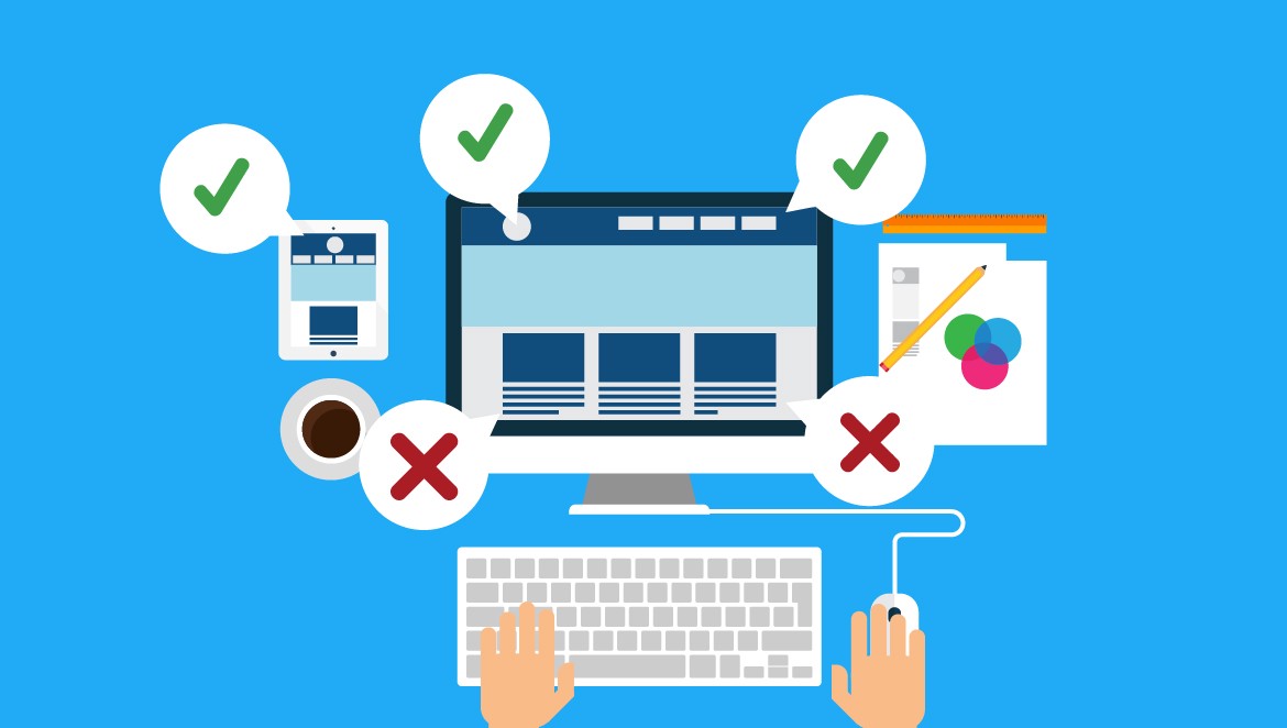
Some common mistakes that could kill your sales
1. Not focusing on responsive design
This is the most common Shopify design mistake that store owners make. They select the theme and customize it for desktop users and forget about mobile users. It’s no secret that mobile commerce has grown significantly in recent years. Therefore, when designing your Shopify store, remember to make mobile devices user-friendly or responsive.
If you do not make your store responsive, you will lose a significant section of your overall potential site’s customers including all your mobile targeted audience. Mobile phones generate more than half of all internet traffic. Thus, if you do not optimize your ecommerce for mobile visitors, you’re losing a handsome chunk of a potential audience at your website.
Hence, make sure you select a mobile-responsive theme. So, if you customize the theme’s design, navigation, CTAs, etc. Don’t forget to optimize it for mobile devices. If your store has full responsiveness built into your design, it will definitely improve sales conversions on your site.
2. Not including site search option
The site search option makes it quite convenient for your visitors to look up the products they need without going through each product page. Many Shopify newbies tend to overlook this important feature on their websites. If you don’t want to lose any more customers simply because they could not search for the product, then include a site search option.
Display the search option on the main menu so that it’s visible to your audience. Most of the themes have a built-in search option. However, if you want an advanced search option, you can easily find plugins for that.
A well designed search function with smart sorting and filtering options improves a user’s experience by ten folds. It makes the browsing faster and if everything goes well, a potential purchase is also possible. So make sure your navigation and search is designed to perfection.
3. Using low-quality images
Your product images are an integral part of your ecommerce store. A customer cannot touch, feel, hold, or try on the product in an ecommerce store, unlike a physical store. Thus, the images on your website must be powerful to provide a clear picture of the product to customers.
Uploading low-quality and blurry images can be fatal for your ecommerce store conversions. If the images are not clear and attractive. In that case, it will be difficult for the prospect to determine if the product meets his expectations or not.
Always upload clear and high-resolution images on your website. In addition, upload product photos from various angles to give a better idea of the items to the customers. Capture your photos in good lighting and with clear backgrounds. If photography is not your cup of tea, hire a product photographer who can take appealing pictures for your website. Apart from low-quality images, poor product descriptions can ruin your website design too.
4. Inappropriate and insufficient product descriptions
Product descriptions play the role of a sales rep in the ecommerce store. An interesting product description can convince your customer to click the buy now button. Yet, many store owners overlook the importance of good product descriptions. Instead of creating a new and convincing product copy, they use the ones provided by manufacturers.
Images give an idea about the appearance and colors of the product. A product description highlights important details such as its weight, size, texture, and benefits. Use the following tips to write persuasive product copies:
- Use a friendly and conversational tone. Refrain from using complex or technical words.
- Avoid using the descriptions provided by the producers or suppliers. They are bland, flat, and not to mention used by hundreds of other store owners.
- Describe all the product specifications.
- Use headings and bullet pointers to increase readability.
- Include primary keywords in your description to improve SEO.
5. Using aggressive color scheme
Colors play a significant role in a website’s design. If the website has a soothing and pleasant color scheme, visitors would love to explore it. On the contrary, if the colors used are sharp and create a high contrast, it will annoy the audience and make them quit your website.
Be very considerate about the colors on your website. Various studies have proven that colors can evoke different emotions. Do not use many colors on your website. It might appear displeasing to the customer and distract his focus from the products.
Select the colors that convey your brand’s image and identity. For example, soft and pastels tones are good color options for a website that sells baby items. If the same website uses black or gray colors, it will not look attractive.
6. Not having appropriate filters
Adding filters to product pages is of great help to visitors. Especially if you have a wide variety of products. Filters can help customers find their desired products in a few seconds. Rather than scrolling his screen for several minutes to search the products. If your product page is long, the customer will get frustrated from scrolling endlessly.
Create filters on your product page to help prospects view products they like. For example, filtering products according to price, size, fabric, colors, etc. Use the following points while implementing filters on your website:
i) Mention The Product Quantity
Always show how many products are available under the applied filter. For instance, if the customer has used the color filter to view the products. Display the number of particles present in each color like: Red, Blue and Black
ii) Display Applied Filters
Ensure to display the filters selected by the customer. A customer might want to add or remove a filter to broaden his selection. Including filters and a site search option makes it pretty easy for customers to find goods.
7. Failure to configure the checkout process
The next common mistake is not configuring the checkout page. Just as the homepage and product pages are essential, the checkout page is essential too. It’s where the prospects place their orders, share their details, and convert into customers.
Many amateur store owners forget to customize their checkout page and match it with the store’s design. Always ensure to add your store’s logo on the checkout page. Moreover, use similar colors, font style, size, etc. on your checkout page as the rest of the web pages. If there is any discrepancy on your checkout page than the rest of the website, your customers will get confused.
Suppose the website’s color scheme is pink and black, and the checkout page’s colors are green and white. In that case, it will confuse your customers, and they might even quit the website if the checkout page doesn’t look like a part of your website.
Use the following tips to optimize your checkout page and make the checkout process hassle-free for the customers:
i) Add Your Brand’s Logo
Uploading your company’s logo on the checkout page makes it look like a part of your website, not to mention it also looks professional.
ii) Provide Multiple Payment Channels
The last reason you want people to quit your website is the absence of the payment channel they like to use. Do not provide just one option to transfer the payment. Provide multiple options to your customers to select the one they trust the most.
iii) Display A Progress Bar
As much as customers enjoy an online shopping spree, they don’t relish the idea of filling out forms. To keep your customers patient, add a visible progress bar on the checkout page. It will let them know how close they are to checking out from the website.
iv) Be Upfront About Shipping Charges And Terms
“When will my order arrive?“
“What are the delivery charges?” etc
The above questions buzz into the customer’s mind when he is placing his order on a website. Hence, disclose your shipping charges and terms. Make them clear from the beginning. If the customer looks at the extra charges added to his bill, he might rethink his purchase, which we are sure you don’t want at the checkout stage.
Hence, do not wait for your customers to arrive at the checkout stage to disclose the charges. Instead, make it clear from the beginning.
8. Overcrowding your online store with plugins/apps
Shopify has a wide range of apps. Entrepreneurs can integrate unique features on their websites by installing the right apps. Such apps eliminate the need to write long strings of code to solve a problem or add functionality to the website. For example, a simple carousel app saves the developer from writing hundreds of lines of different codes.
Apps are, without a speck of doubt, beneficial for entrepreneurs. Hence, many store owners make the rookie mistake of installing every app that they come across. They believe that more apps will make their website/store more functional and better than others.
However, installing many plugins/apps can create the following problems on your Shopify store:
- Make your homepage crowded;
- Disturb your visitors with annoying pop-ups;
- Affect your site’s speed
This doesn’t mean that you shouldn’t use apps, no! Use them when you need them, but don’t stuff your website with them. Overcrowding of apps is one reason for the slow loading of a website.
9. Slow loading time
Slow-loading websites are a mood killer for indulging in retail therapy. Do not expect online buyers to be patient while your website takes forever to load. They will exit it without thinking twice; it will increase your bounce rate and damage the SEO.
Thus, your website must speed up to keep up with the expectations of impatient and hurried buyers. The ideal loading time for a website is under 3 seconds. Moreover, 70% of buyers reported that page loading time influences their purchasing decision. All your efforts in designing the store will go in vain if the page cannot load fast. The customer will leave your store, probably to visit your rivals’ websites.
Select a Shopify theme that is fast. Besides that, compress your code and images files to make the website load faster. Also, uninstall the plugins that you no longer use as they add extra load to the webpage and slows down its speed.
10. Spelling and grammar mistakes
A website looks terrible when it has spelling, grammatical, and punctuation errors. Imagine how a simple mistake of writing ‘Add to Cart ’ in CTAs instead of “Add to Cart” is going to bug your customer? Even though it doesn’t change the meaning, it will affect your brand’s image and credibility in customers’ eyes.
Not to mention, it might give them cold feet to purchase from your website. Thus, do not rush writing your web content or product copies. Take your time to write content. And then proofread it a gazillion times to rectify the errors.
11. Call To Action (CTA)
Currently, the carousels on the main page are popular: load a series of images; then the carousel is automatically transferred from one to the other. It’s an easy way to display multiple products and add some variations to your homepage.
The problem with these is that they are often just a series of random images. In most cases, your homepage is the first thing buyers will see. If the first thing they notice is an aimless carousel, then you have just lost the precious attention that could have been brought to the street of sale.
Avoid this by making sure each image on your carousel has a clear “call to action.” Do not label only the object shown; Tell them “Click here” or “More information” for them to see more detail.
12. Extraordinary navigation
Navigation is one of the things that you should do well because it’s probably the next thing a user sees after seeing your title. Some stores, however, can’t seem to get navigation right. They get it wrong, making their store too generic to figure out, or include far too many options to select.
According to a test, which takes into account the design of the site, more than 70% of users choose a link to click instead of using the search. This is consistent with another study that shows that users only use search if they cannot find what they are looking for, which means you should not trust the search button as a crutch.
Wrap up
An important element that will determine whether or not prospects will keep on checking your site is your value proposition. It will define the attractiveness of your products towards prospective buyers. It will also determine your product’s uniqueness and brand, which will make you rise above your competitors.
Meaning, your value proposition will convince them to purchase your product. Unfortunately, a lot of ecommerce sites have no clear or bad value propositions. Most of them fail to communicate the most distinctive aspects of their product. As a result, buyers couldn’t make up their minds whether to purchase the product or not.
So, it’s time to check your website for these design mistakes. If you spot any mistakes, you know how to fix them and boost ecommerce conversions.