20 Feb

The user experience (UX) is all important in the ecommerce business. An easy to use website is what is mostly liked by people. Visitors want to navigate to your site freely without any obstacles.
One of the best ways to decrease your bounce rate and boost conversions is to avoid these common UX mistakes. Hence, your mission should be to create engaging user experiences, that help site visitors accomplish tasks and increase conversions.
What is UX?
UX stands for User experience, it is about how a user interacts with, and experiences, a particular product, system or service. It includes a person’s perceptions of utility, ease of use, and efficiency. User experience is an important concern to many companies when creating products, as negative user experience may decay profitability. User experience is subjective.
Website UX mistakes
Let’s discuss some top most painful website UX mistakes.
1. Cluttered navigation
Navigation is the most important part of any website. It is the gateway to the services you offer. This is the point where you really need to focus while building. Website navigation should be easy to understand. Your navigation should be an architecture of well-structured, groups of pages; either commercial or informational (depending on your business).
Some of the most common mistakes we see are:
- Links without value in the main menu
- Excessive anchor text
- Non-responsive (yep, it still happens in 2019)
- Too many sub-menus
- Relies on Javascript (with no fallback)
How to fix your site’s navigation
The golden rule here is to make your navigation accessible, responsive and clutter-free. Think about your categories, your most valuable pages, where users spend most of their time and, more importantly, who your users are.
2. Large, Fixed Headers
It’s a common UX mistake to go overboard and stuff the sticky navigation header with content. More and more tall sticky headers can be seen on websites. Branding blocks and navigation menus that have a fixed position and take up a significant amount of space. They stay glued to the top of the browser window (the “sticky header”) and often block the content as it scrolls underneath them.
Some headers on big-brand websites are over 150 pixels in height. Fixed elements, such as sticky headers can have real benefits, but you should be careful using them. You can make a sticky header, but by making it slightly transparent so people can still be able to see content through it as they scroll, which makes the content area feel more substantial.
3. Poor page structure
As you’re writing more and more blog posts, or add more product pages, your site will get cluttered. You need to organize it neatly, to make sure you, your visitor AND Google will be able to find what they’re looking for.
Site structure refers to how you organize your website’s content. Also, site structure deals with how this content is grouped, linked and presented to the visitor. Create a clean layout, stunning visuals, and a responsive design that looks beautiful across all platforms.
When it comes to site layout are: margins, padding and alignment. Alignment is a big issue and even a small amount of misaligned content/imagery can look unprofessional. Web pages work in columns which provide a structure for designers to create landing pages which can influence users’ focus and attention.

4. Working with fonts
Thin, light type may look good on many designers’ expensive, finely-tuned monitors, but the average user who often sees our designs on cheaper, substandard displays must also be considered. The best practice is to check how fonts look on all major devices: desktop computers, laptops, tablets, and smartphones.
Once you’ve chosen a single font family or families, consider how you can create contrast between header and body content. Single font selections with varying font weights can create a very visually pleasing contrast between sections of your page.
A poor font selection can even make a retail giant, such as Amazon, look untrustworthy and unprofessional. If you’re struggling for ideas on font pairing, you can use Font Pair to put together different font types. It’s important to remember that font readability will play a huge part in how users consume content. Consider:
- Size
- Width
- Paragraph spacing
- Weight
5. Page load times
Page load times impact conversions. The most common reason for page loading time being high is images. It’s all about saving the right file type, using the right dimensions and compressing high-resolution to preserve quality, whilst reducing size. Also, savings in KB can often make a huge difference.
Fix image bloating
You can run speed tests using Google’s Lighthouse or GTMetrix to get an understanding of which files are too heavy. It’s simple to find poorly optimized images for individual pages. For batch analysis, we recommend using a tool like Sitebulb which has an incredibly in-depth section attributed to page speeds.
If your images are already on your site and you don’t really fancy opening Photoshop and resizing them all, you need to run batch compressions to reduce the file size. There are a range of image compression tools available online, we recommend Compressor.io or TinyPNG. It’s often thought that compressing images means poor quality.
6. New image formats
Google Developers introduced a new file format which is considered to be superior to its PNG and JPG equivalent. It offers fantastic lossless and lossy compression for images. Shaving milliseconds off your load time, especially on poor mobile connections, can stop a user from leaving your site.
Google has said it actively rewards sites that are seen to make incremental improvements to site speed. And the most amazing thing is more than 70% of browsers support this media format.
7. Pop-ups and carousels
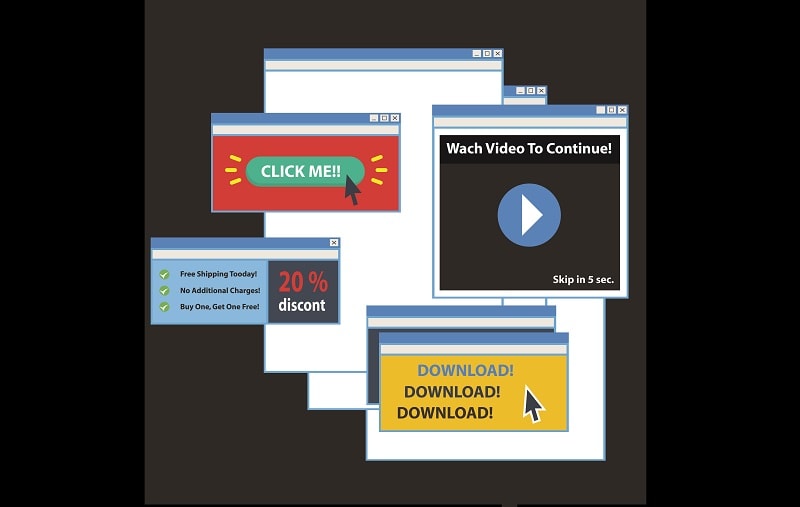
First things, don’t ever use interstitial pop-ups. It will annoy users and could defer the rendering of your page in search engines. Both are bad for business. It’s recommended to use pop-ups in a more subtle manner like; top banners, chatbot and native CTA banner.
Chatbot
Chatbots are a great way to help users find what they’re looking for, without disrupting their experience. If a customer is finding it hard to find a particular area of the site, chatbots can remove this friction quickly to help retain users.
Native CTA
Another smart way to offer discounts to users is to integrate CTAs within product selections or even at category level as a header banner. We find this to be a great way to preserve UX and still help drive incentivized clicks to sale or discount pages. It’s always important to remember to design banners to match the size and resolutions of your products.
Carousels, a slideshow for rotating through a variety of content are very common on the web, especially on landing pages and homepages. While they can be useful, they have numerous usability issues and therefore qualify as another common UX mistake. If done right, a carousel can engage users with large striking images.
The trouble is, carousels often don’t add any additional value but are simply there for decoration and only included because everybody else is using them. A way to test if a site carousel makes sense: write down three benefits a carousel provides for the visitor. If three meaningful benefits can’t be found, it doesn’t add any value.
Summary
If web design trends are not considered carefully and implemented with caution, it could lead to several common UX mistakes. Poor UX leads visitors to move to another site. Data shows that UX is still a bit of a mystery to many marketers, but it should be the most important factor on any site design.
When considering how to improve your user’s experience, you need to remember how you feel navigating a site with poor UX. Therefore, do consider some easy fixes like; fonts, images, colors and navigation first, before you think about CRO (conversion rate optimization).