01 Oct
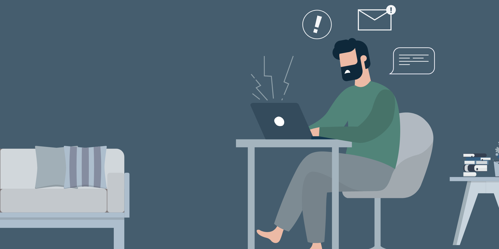
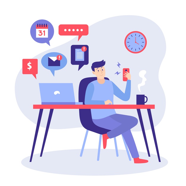
You have less time to hook visitors into staying on your website and interacting with your content. From the moment they access your homepage, it’s a matter of seconds before they decide whether they stick around or move on.
Overcoming this problem is one of the greatest challenges on your path as a small business owner creating your website. You have around 10 to 20 seconds to capture and engage a website visitor before they leave your website. This, of course, is not a lot of time. As such, it’s imperative that your website is optimised for the human attention span to increase your chances of securing those valuable conversions.
So, knowing you have such a small window to hook people in, what can you do about it? Here are ways that the decreasing human attention span will affect your website.
Plan the flow
Consider yourself in the shoes of your website’s visitors. They will follow a specific path from the time they first view your website header to the time they scroll down to your website bottom. If you can plan their flow of browsing through your web design, you will be able to make it more efficient and satisfying. To do this well, you need to start by focusing on the ultimate goals that you want your site visitors to accomplish.
If you’re an online store owner, completing purchases is a clear goal. If you run a blog, subscribing to your newsletter is an important one as well. Other significant goals include booking appointments, sharing your content on social media or filling out a contact form to request a price quote for your services. With the end goal in mind, start outlining the flow that would take site visitors from start to finish in the shortest, smoothest way. Here are a few improvements you could make:
- Minimize the number of pages they need to visit before they can accomplish that goal.
- Add clear Call To Actions [CTAs] to encourage direct action.
- Remove or reduce content that seems redundant or could be distracting.
Optimize “above the scroll”
The area of your website that is instantly visible to site visitors before they need to scroll further down is referred to as “above the scroll.” What happens there will be the first thing that greets visitors when they first load your website, which makes it highly important. This is your chance to make a good first impression.
Your goal is to build that first-contact section in such a way that it quickly grabs the attention of your visitors. With so much online competition, this has to be a love-at-first-sight situation. The part “above the scroll” should not only be attractive, but it should also make logic. You want that section to achieve three goals:
- Show what your site is about.
- Inspire visitors to read more, search for products, browse your galleries, or whatever action corresponds to your ultimate goal.
- Lastly, the “above the scroll” section should give visitors a clear idea of how to achieve these goals when they continue to browse.
Visualize the information
Text in bulk and large quantities can make visitors move away. Even professionals who deal with heavy amounts of text (like authors, academics or journalists) should avoid piling up paragraph over paragraph and consider more approachable modes of presentation, particularly visualization.
Visual information serves two purposes. First, it transmits information easily, and second, it really adds to your website’s aesthetics. You can visualize content in multiple forms, including introduction videos, statistical graphs and charts, before and after pictures, size and measurement illustrations or simple animations that explain action.
Fight the clutter
Allowing your site visitors to become sidetracked is a bad idea. Maintain a clean and spacious website so that visitors may concentrate on what really matters (Not to mention, embracing minimalism is a major web design trend of this year). It may seem tempting to cram as much content as possible into your website, but an overcrowded website is not just a design fail, but it will also negatively impact its performance.
An important term to mention here is “whitespace,” which in web design lingo basically refers to any portion of your website that doesn’t include any content. Even if this seems counterintuitive, whitespace is good. Great, even! It is the “empty” spots that really call attention to the content of your site. Make sure you use whitespace generously to make your website come to life.
Make the search easy
People arrive at your website looking for something. Unfortunately, the declining attention span of the human species means they won’t have the patience to look for too long. You can assist your visitors in finding what they need before they get too frustrated and look elsewhere by using some digital tricks. Here are some great ways to do that:
- Integrate a ‘search bar’ to allow visitors to find specific keywords throughout your website (choose from a variety of search apps available on the App Market).
- For an online store, you can add product filters to help clients focus their shopping experience.
- Display a tag cloud on your blog, so readers can immediately find the articles they are most interested in.
Work on your colors
You’d be amazed to learn how colors can influence a website’s browsing experience. In addition to giving your website a gorgeous look, the site’s color scheme plays an important role in enhancing the layout and guiding visitors through your site. Here are just a couple of ideas for what you can with colors:
- Draw visitors’ attention to specific items by accentuating them with colors.
- Use shades and tones of the same colors to build a content hierarchy, so visitors know where to start and where to continue.
- Make your texts more easily readable with a good contrast between background colors and text colors.
- Use color psychology to create an atmosphere and get your site visitors in the right mood.
Start a chat to grab their attention
When visitors browse through your website with questions and can’t find the answers, they will most likely go look elsewhere. Use the chat feature to offer immediate responses and keep them hanging longer on your page. With chat, you can even initiate the conversation yourself and ensure your visitors that you are there to assist them. You have full control on when the chat is visible to visitors, so that they don’t reach out when you are unavailable to answer immediately. The great thing is that you can operate.
Capture your visitor’s interest
With short attention spans, it is important to capture the interest of your visitors quickly. There is no better way to do this than by working with the ‘above the fold’ portion of your website. Above the fold in web design refers to the portion of your website that is visible without scrolling. For most website home pages, the above the fold section will feature a banner and some form of call to action for new visitors. This is what you should optimise. A strong call to action in the above the fold on your website will help in multiple ways:
- It will engage your visitors and create interest in your products or services
- also, It can guide visitors towards a sales funnel through subsequent webpages
- It informs visitors on what they need to do next if they are interested in what you have to offer
Without a strong call to action, you provide little guidance for your website visitors which can result in your traffic navigating away from your website.

Reduce loading speed
According to a study conducted, 40 percent of users will wait no longer than 3 seconds when loading before abandoning a website. That percentage increases by 10 percent for every 1.5 seconds thereafter that a website takes to load. This means that if your website is slow to load, you could be losing nearly half your traffic.
“Slow” is the worst thing you can say to a website owner. A slow website means less traffic, less conversions and as a result, less business. You can expect people to sit and wait while the screen is taking forever to load. Take action and reduce the site’s loading speed with these Steps:
- Optimize images, so they look great but don’t weigh your site down.
- Divide your heavy files into separate pages, so they don’t all load together (for example, photographers can create separate gallery pages for commercial work, landscape, portraits, etc.).
- Go easy on the use of animation. These cute little things can slow you down. For everything about using this enticing feature, check out our guide on how to add animation to your site.
- For heavy content files like music or video, choose streaming rather than direct upload.
Don’t neglect your mobile experience
Mobile devices play a huge role today in web consumption. In 2018, 52.2 percent of all website traffic worldwide came from mobile devices, up from 50.3 percent in the previous year. That’s over 2.18 billion people who are using their mobile phones regularly to browse the web. If your website is neglecting the mobile experience then chances are you are missing out on potential conversions. Even Google uses a poor mobile experience as an SEO ranking factor and penalises websites that aren’t optimised for devices.
It is important to review your website on a mobile device to identify easily fixed issues. Your website should be as fluid and easy to navigate on a mobile phone as if it is on a desktop computer. If you are finding that you are having problems, so will your visitors. Google allows you to do a free mobile-friendly test of your website which is often a handy starting point if you are considering optimising the mobile version of your website.
Keep your messaging clear and concise
With our decreasing attention spans comes a decrease in patience. You should assume your website visitors are impatient and want their questions answered as fast as possible. This is where clear and concise website messaging helps. Your website messaging should answer the following questions:
- What is this site about?
- And What products are sold or what services are offered?
- What makes you different?
- What are the site visitors supposed to do next?
Take your website home page for example – these questions can be broken down into their own sections of your home page:
- What is this site about? The answer to this question should come from your logo, slogan, and content above the fold.
- What products/services are offered? Summarise your products and services directly below the fold. Keep it simple with 3-5 summaries.
- What makes you different? Answer this question by providing a small description about your business on your home page. If you have more to write, link through to your ‘About us’ page instead of overdoing the content on the home page.
- What are the site visitors supposed to do next? Your call to actions spread throughout your page answer this question. If you want your visitors to contact you, add “contact us” messaging. If you want product sales, include “buy now” buttons. Be explicit with your direction and instructions to avoid confusion.
Test, and test some more
Once you have followed all the tips listed here, it’s time to put on the lab coat and do some testing. After all, if you want your website to overcome the attention span problem you need human subjects to experiment on. Gather feedback from friends and family and hear what people have to say about the site’s user experience. Give them tasks to perform on your site and measure how long it takes to complete them. Run your tests on people with different levels of savviness, using different types of devices and browsers. The larger the sample you collect, the more prepared you will be to make improvements.
Wrap up
Keep the statistics in mind as a way to motivate you even more to focus on creating compelling content. More content may drive more clicks but will fail to engage if that’s not original. Good content will get more of the right clicks and engage more in order to deliver real results for your business.
Still, there are way too many spammers and time-wasters out there so you HAVE to stand out and make the most of your audience’s attention span. Optimize your site, grab their attention within a few seconds with proper targeting and a compelling pain point, and spend the time & money required on research to be the thought leader they’re looking for.