22 Jan
If your website is mostly to communicate information about your business and one or two products or services then one page website is perfect fit for you.
One page website loads fast, Also it doesn’t require navigation between pages to find what they’re looking for. All they have to do is scroll down. Moreover, these kinds of websites are easy to build, maintain and to create an effective sales funnel because you can design the page as the funnel without having to hope visitors will click through to each next stage.
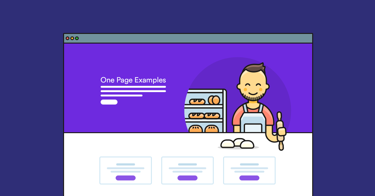
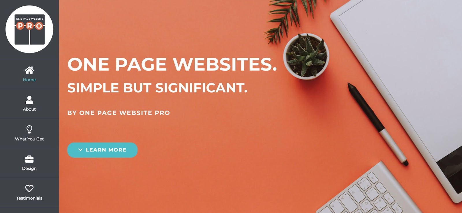
Nowadays, one-page websites are one trend that’s growing due to its functionality. In essence, it’s a site that presents all of your content onto one long, scrolling page. Rather than distinguishing a homepage from the other pages, content is split into different sections using strips.
Advantages of having a single-page website layout
1. With one page websites, you control the flow of information. Visitors need to browse through the site in a linear fashion as opposed to clicking around a multi-page website from one page to the other. Therefore, you’re able to direct visitors through the information on your site in a predetermined order.
2. You take the visitors through a unique journey. One-page websites are usually designed to be aesthetically complex, so your visitors are more engaged and you can take them on a journey instead of just having a passive experience.
3. Minimal text is sufficient. You need to be able to convey your message in the least amount of text. Too much written information on a one-page website is overwhelming.
4. It’s ideal for mobile devices. The push towards responsive design has eased the difficulties of navigating websites on a mobile device significantly, but it can still be less than ideal on a smartphone with a small screen. By contrast, single-page websites are much easier to optimize for mobile. They are also much easier to navigate, with users only having to scroll to find the information they need, an action we’re very used to thanks to the likes of Facebook, Twitter and Instagram.
Disadvantages of having a single-page website layout
1. SEO
Most organisations want to rank organically for a number of phrases. After all, most organisations do/sell more than just one thing, and often in more than just one location. However, a single-page website is difficult to optimise for more than two or three without your efforts appearing spammy. What’s more, you only have a single title tag, meta description and URL to make use of. A single-page website won’t allow for you to incorporate a blog either.
Adding fresh content to your site regularly is thought to be key in ensuring strong organic rankings, while blogging is also one of the most effective methods of driving traffic to your website by giving you the chance to rank for more niche searches.
2. Page load time
Google confirmed way back in 2010 that site speed was a ranking signal, and this is another speed bump for single-page websites. If all of the information that would otherwise be spread across many pages is on just one video and graphics etc. it could become pretty large. The more content and data a browser has to download from the server, the longer it takes to load. This not only negatively impacts your SEO, but it also seriously damages user engagement.
3. Can’t share lots of information on one page
Some companies need a lot of content to explain their offering (though every copywriter should be wary of overwriting, even for the most complex of products/services) and if this is the case for you then a single-page website might not be suitable.
You don’t want to overwhelm your audience with too much information all in one place as this is one surefire way to kill user engagement. If your company provides various different types of service or product, a single-page website is almost certainly not for you.

How to build one page website
1. Decide if it’s a proper fit for your business
There are two main schools of website design: the one-page and the classic. Depending on your type of business and what features and priorities you have for your website, one type of website layout might be a better fit than the other – it’s worth weighing your options.
A one-page website has a strong design that’s both minimalistic and organized. It’s typically more image-heavy and includes just a small amount of text. The overall long scrolling design makes it easy to get creative while crafting a story where you have full control over the order in which your content is seen.
One of the best website layouts, a one-page site enhances the user experience by allowing visitors to consume your content in a very linear way, instead of getting lost in multiple pages. The format is well adapted for mobile websites and tablets, too. A one-page website is also easy to maintain and requires fewer resources than a classic website.
So after reading about this website trend, you’re probably already envisioning your own website in this grand format. But first, you need to ask yourself, “is it a good fit for my business, specifically?” From the most creative to the more traditional businesses, this format has the potential to look amazing. If you have short form content, like a landing page, freelance website, photography portfolio, wedding website or any event-related website, then it’s worth considering.
A classic website is what most people think of when they envision a site – there is a homepage accompanied by other pages, such as a contact page, a service page, and an FAQ page.
Basically, the main reason to choose this web design format over a one-pager is if you have tons of content that is absolutely necessary to include on your website, such as a variety of products or services in an online store.
A multi-page website will enable you to organize each piece of content into its own page, giving you enough space to provide long and thorough descriptions. For example, if you want to create a blog, this classic format will allow a user to easily browse through your articles individually.
2. Devise a plan for your content
If you’ve decided that this format is the right fit for you, then you can get started with crafting your beautiful one-page website. When creating your website structure, the first step is to lay out all of your content strategically. Creating a one-page website is the perfect opportunity to control the order in which your site is viewed, so make sure that it’s logical and intuitive.
Begin with a hierarchy where you imagine your visitors’ journey through your site. They first need to be enticed by the main message that you want to convey from the get-go – in other words, what you want to place ‘above the fold’ (i.e., what a viewer sees before scrolling down your website).
For every website, you’ll need an About section and a dedicated area to display your contact information. What comes in between can include your offering, a CTA (call-to-action) button, a meet the team, services and products, testimonials, FAQ section, and a photo gallery – depending on what information you want and need to provide.
Prioritize the order of your content as this will prove extremely important later on. Also, remove any extraneous information. When it comes to words, less is more here if you want to form a strong design. Overall, strive to keep things as organized and simple as possible.
3. Choose a website template
Once you’ve devised a plan for your content, you’ll need a template that sets you off on the right foot by including all the elements a one-pager website needs, like an anchored menu, strips and columns, a social bar, a rich footer and more.
There are hundreds of fully customizable one-page website templates created by our designers and available for any kind of business. The fantastic thing about these templates is that you can change everything from the header right down to the footer, to customize and make it completely yours. Let your creative imagination flourish with these endless possibilities!
4. Break up your content into sections
Now you’ll need to take your organized content and display it on your website. You can add text, videos, images, a contact form, testimonials and more. Add as many sections as you require, and then arrange them in the order you want to present your content. Traditionally, you’ll want to start with the ‘About’ section and work your way down, ending with a rich footer that acts as your ‘Contact’ section.
5. Add a relish of parallax effects
Another popular web design trend that’s eye-catching and engagement-boosting is parallax scrolling. This is an effect that creates a 3D illusion on your website with the different strips you’ve added in the previous step. It does so by making the layers in the background and foreground seem to move at different paces as the user scrolls down your site.
As one-page websites may seem slightly one dimensional, adding an effect like parallax scrolling gives your site that extra punch it needs. To create parallax effects, you can add subtle animations to your strips, like zoom in, reveal, and fade. This professional website technique is one surefire way to get your site visitors to scroll all the way to the bottom.
6. Build an anchor menu to link each section
You’ve heard of website menus before, but this one is slightly different than what you’re used to. With a one-page website menu, each item (which is anchored) links to a different section of the same page, rather than to a page of its own.
But first, you need to define these sections by implementing the so-called ‘anchors’ exactly where you want them. There are three mandatory and important steps to create an anchor menu and achieve an organized one-page design:
- Add an anchor: This makes it easy for users to navigate to different parts of your single page website by allowing them to go straight to a particular section. Many templates already have anchors built-in, but you can rename, move or delete them at any time.
- Link your site’s menu to the anchor: This allows users to go to a particular section of your page from the menu. When anchoring, you should select the corresponding section to attach your anchor to. In other words, the title that you choose to give each anchor will appear on your menu list – thereby playing an important role in your website navigation.
- Create order in your menu: The order in your menu needs to correspond to the order of your sections for ease of scrolling and friendly navigation. For example, if you have a horizontal menu, the first item on the menu (normally ‘About’) should align with the first section (also, ‘About’), and so on. Since one-page websites usually involve long scrolling, you should keep your menu visible at all times on your site by freezing it. You can either create a floating anchor menu or, if your menu is in the header, you can switch on the ‘Freeze Header’ button to fix it to the top.
7. Make it easier for users to scroll through your website
In the long format of a one-page website, users may become so consumed with your site that they find themselves scrolling and scrolling, enjoying your captivating content as they go.
To provide your site visitors with a hassle-free experience, simply add a back to top button to allow them to reach the beginning of your website with just one click. This button remains in a fixed position on your website so that it’s visible when a visitor gets to the bottom of the page.
8. Implement a strong CTA
Since all of your content is presented in one place, there needs to be something that draws in the user’s attention to your main priority – whether that be signing up for your newsletter, requesting a quote or booking your services.
This is where a CTA (call-to-action) comes in. It’s a short phrase that prompts your online audience to take immediate action. It should be placed above the fold on your website for the best visibility, making it a great opportunity to send viewers to a later, high priority section. Take a look at these landing page examples to see how CTAs can be used effectively.
To do so, you will anchor your CTA button similarly to how you linked the different sections in step six. After adding a button, connect your CTA to an anchor to allow visitors to navigate to a particular section. For example, if the CTA says “Contact Me,” then you can anchor it to your “Contact” section.
9. Include a rich footer
A website footer is the area at the very bottom of your website. Most people navigate there when they are looking to find important information, like how to contact a business. This is why it’s crucial that your footer contains up-to-date contact details, links to your social media accounts, operation hours, your privacy policy, and terms and conditions. If you have a physical store location, you can add a map to the footer as well.
10. Incorporate your social media accounts
It’s important to seamlessly connect every aspect of your online presence. One way to do that is to connect your Facebook, LinkedIn and Instagram profiles with your website. Why? Because you want to draw as much online traffic as possible to your site. There are a few ways to incorporate your social media profiles on your site to get more clicks and make them truly stand out:
Add a social bar to your website: This is a place that contains icons for all social accounts where your business is present. When you create a social bar with Wix, you can choose from several design options for the social media icons. All you need to do is choose one of them and add links to your different pages. To make sure that users always see this element as they scroll through your site, right click on the element in the Editor and press ‘Pin to Screen.’
Add your Instagram feed: Why not give your Instagram feed even more exposure by incorporating it into your website? It’s also a good way to provide users with current photos of your business and whereabouts. When you add an Instagram feed, you can design it to your liking by choosing from one of the many custom layouts to display this information.
11. Keep SEO in mind
Search engine optimization (SEO) is an important element of every website. It’s the practice of optimizing your site so that your page ranks higher on specific keyword search results hence, drawing more traffic and potential customers to your website. Begin by making sure that your website is indexed on Google (a.k.a. saved in the database).
12. Make your website mobile-friendly
Browsing the Internet on a smartphone rather than a desktop is the norm these days. This is also why websites are now being ranked in terms of SEO by their mobile version, first (see Google’s mobile-first index).
What does this mean for your website? Simply put, it needs to look just as good and be just as functional on mobile as it is on desktop. Considering the fact that readability and navigation are important in this process, you’re already headed in the right direction by choosing to create a one-page website.
Also, there’s more luck headed your way if you have a Wix Website, as there’s an automatically produced mobile version of your site that looks great on any device. Just go into the Editor, switch to the Mobile Editor, then preview your mobile site.
On Editor X, an advanced website creation platform from Wix, you can take this a step further and build fully responsive websites for a variety of viewport sizes, allowing you complete design control.
One added tip to make your mobile site even easier to browse through is to utilize unique mobile features, such as installing a quick action bar. Since the social bar doesn’t appear on mobile sites, this acts as a great alternative to trigger readers to search for any information they may need, such as your contact info.
Conclusion
Even though a one-page site is simple, you need to include the key information your customers need to know they’re in the right place, find what they’re looking for and take some kind of action, whether that’s calling you, buying your product, booking an appointment or something else.
You can use this checklist to make sure your page has everything it needs to work well. Here are some must-have elements every one-page website needs:
- Your business or company name
- Your services or products
- An about section that explains who you are and how you help customers
- Contact information. Stick to the methods you use most often, like your phone, WhatsApp or email. That way you won’t miss out on customer inquiries that sit in your Instagram DMs for days.
- Customer reviews or testimonials. If you can embed third-party reviews on your site, they can enhance your business credibility. Customer testimonials that include names and photos can be very effective, too.
- Your call to action. Do you want them to call you, send a text, or buy something? Make the ask.
- Social media buttons but only for the platforms you update regularly. Linking to a feed that you don’t have time to update any more can erode trust in your brand, so keep it fresh or leave it out!
- Great images. You need at least one image for the site header that features your logo. It can also feature your product or reflect the type of services you provide.