23 Jan
It is rightly said that first impression is the last impression is also applicable for header design as it is the first thing that gets the attention of the user when they visit the website. A well designed header plays an important role to attract the users and sets the tone of every aspect of the website.
Whether you’re starting from scratch or giving your current site a makeover, we’ve got a compilation of the best practices for crafting a header design that’s as smart and attractive as the rest of your website.
What is a header?
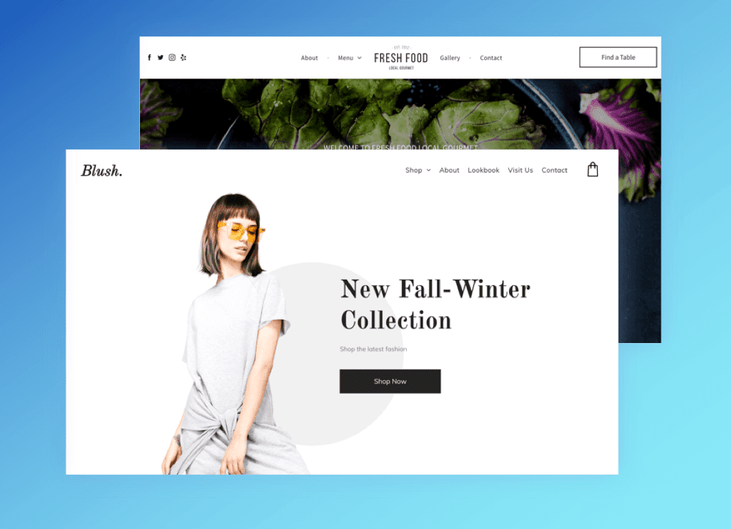
In a webpage, a header is the top/upper section of the website. This strip of content is shown consistently on top of every page. The header is designed in a such a way that other than containing the brand’s name and logo it also helps visitors to navigate the website easily.
An equal amount of strategic thinking is involved with designing website header like every other aspect of a website that it should reflect your brand. A good header design is like an invitation to people as it provides the clear idea and information about the website.
What should you include in a website header?
The website header is important to represent the identity of the website. A clean and compact header is ideal so that we can add more value with the rest of the page and simultaneously it is also helpful for users to easily get the core information to navigate through the website.
A header usually does not take much space. So, while considering what should be included in the header it is important that it should contain parts that you want your website to highlight.
Following are the parts that are usually added in the header:
1. Business Name
Including your business name in the header acknowledges visitors that they’ve arrived at the correct location. Additionally, the presence of your business name at the top of your website can only strengthen your brand identity.
2. Logo
The identification of any brand or industry is its logo. Adding the logo in the header emphasizes the brand identity. It doesn’t matter what industry you belong to, your logo is the star of all your marketing assets. There is no particular position in the header as to where it should be added. It may be added at the right, left or even at the center. An important thing to consider is that if your brand logo is big then it should be adjusted to fit in the size of header and should not occupy the whole or a larger space of the header.
According to a study, it’s found that users are more likely to remember a brand when they see their logo on the left-hand side of a website’s header.
Pro tip: If you’re worried that your logo is too big for your small header space, you might want to create a variable logo, which is a smaller, simpler version of the real thing.
3. Navigation menu
The default location for the navigation menu is the website’s header. It’s a list of your website items like About us page, product page etc and linking each to its designated location. Including a menu in your header is a logical decision, since it can’t be missed. This provides visitors with straightforward website navigation, securing a positive user experience.
4. Shopping cart
If your website includes an online store, adding a shopping cart to the website header will simplify and improve your shopper’s checkout process. The basket icon is recognized as checkout location as users continue to browse and add items to their carts. Moreover, the customers won’t forget to fulfill their orders and pay with ease.
5. Search bar
This is the most important part. Adding a search bar to your header gives users the option to perform a search on your site, displaying a clear list of items connected to the query. Whether you have an online store or a blog site, a search bar will help visitors find posts related to the topics or the product they are most interested in.
Therefore, when you add this element to your header your visitors will never miss it and they’ll probably appreciate easy access to the search bar at the top of your page.
6. Login
A membership website usually requires users to log in, since its purpose is to protect exclusive information from the public. Whether members pay for a subscription or not, you’ll have to give them credentials in order to access your website’s members-only material.
Therefore, you’ve got to have a clear place for them to login, and the most obvious location for indicating a login form is at the header of your homepage where everyone can find it.
7. Social media links
Want more followers on your social media like Facebook, Instagram accounts? The best way to do so is to add social icons to your website and link them to your desired social media accounts. It will make it simple to turn website visitors into followers and likes.
Usually, social links are included in a website’s header or footer design. Placing these links to the top of your website definitely means users will see them faster. However, if space is an issue in your header’s design, don’t stress about fitting these in here. Most users are aware that social media icons appear on a website’s footer, and it’s likely they’ll check there too.
8. Languages
A multilingual website is impactful as it attracts more users to use it. Adding the language menu on the header helps the audience to know that a particular can be used in different languages and they can select their required language from the range of languages provided by the website.
Best practices for website header design
The header is the first thing users see when they visit a website. However, designing a unique header is challenging. Designing a website header involves plenty of thought and effort, especially since it involves finding clever ways to include information into a limited space.
Every header design can benefit from the following practices:
1. Use clear, readable fonts
Your header is the top part of your page therefore use clear and readable fonts. When you create your header, choose a font that is representative of your brand identity, but more importantly it should be easy to read. Since your text is there to guide your audience, its purpose would be lost if they had to put in too much effort deciphering it. It’s also smart to keep the words short and in a relatively large font size to make the header readable at a glance.
2. Keep a consistent design
There is no standard size color or even shape for a website header. Your header should never go unnoticed because it serves as a design element embellishing the appearance of the rest of your site.
Just don’t forget to follow some rules like, try to make sure your header’s size doesn’t interfere with the way a user experiences your content. Also, keep visual elements like the color scheme and fonts consistent with the rest of your website’s design.
3. Include a clear call to action
Effective call-to-action button on your header is what everyone sees. For example, if you have a restaurant website, include a call-to-action button in your header that reads “order here”. Or in the case of a nonprofit website, this would be an excellent place to encourage visitors with a “donate now” button. Make sure your message is enticing, clear and can be summed up in one or two words.
4. Add illustration or animation
If you have some extra space in your header then adding some animation or illustration can make your header look more attractive. With amazing technology of vector art, it’s easy to add high-quality website graphics including illustrations or animations of any size. Incorporating illustration or animation will give visitors a surprising experience by adding a dynamic detail in an unexpected way.
The header possibilities
All headers are not the same. Before you design your own website header, consider some of the unique variations out there. You might find they provide a better solution to your web design needs:
1. Fixed website header
In other words, fixed headers are called Persistent navigation bars. This navigation follows you around the page while you scroll. This is now a web design standard. It stays pinned to the top of each website page, so users will see it wherever they go. This is a very straightforward way to give users access to information at all times, providing an outstanding navigation experience.
Moreover, Fixed headers improve the customer experience, keeping users oriented and giving them more control. Make the header fixed if it doesn’t violate your overall design concept. It’s a good idea for both desktop and mobile designs:
- E-commerce websites — the cart is always in front of the user.
- Service websites — the phone number or a CTA are constantly on display.
2. Hidden navigation (hamburger menu)
The hamburger menu is a small icon consisting of three horizontal lines stacked one on top of the other, that displays the full menu when clicked. This technique is used by designers when they need to focus on the main screen.
Additionally, the hamburger is suitable for promotional sites, where the main emphasis is on the high-quality presentation of the product using photos or videos. For online stores, this option might be less suitable, since it’s important for the customer to have a basket, selected products, and a search field in quick access.
3. Mobile header
Nowadays, majority of website browsing happens on the go. Hence, it’s increasingly important to make the header correctly displayed not only on the desktop version of the website but also on the mobile one. So it has to be responsive and able to adjust well to any mobile device. It might mean adjusting the size and content included in the header’s design, or adapting a hamburger menu into your mobile version.
4. Shrinking header
If you have an amazing background image that needs to be shown and also you want to incorporate a header into your website’s design then this type of header is called shrinking header. It is designed to dissolve into your website’s background as users scroll down. Visitors won’t see all the time, but they’ll know it’s there.
Moreover, implementing this header style will create a stunning effect on your website, and would go great when paired with the magical 3-dimensional effect of the parallax scrolling technique.
5. Headers with a message
Before designing a header, consider the overall style of the website and its main purpose. Adding text to your website’s header is a great way to give your viewers a personal or professional message from the start.
For example, your header space can be used to incorporate an inspirational quote that relates to your brand or service. Alternatively, it can be an attention grabbing spot to add updates about your business, or to greet visitors upon arrival to your welcoming website. There are several possible messages a header can convey:
- urge a consumer to do something
- work on trust-building
- encourage a visitor to know more
- be amusing, etc.
Conclusion
The header is an integral part of a website, so businesses should take the time to create a header that’s attractive and practical for their users. And one of the best practices of a website header design: make regular alterations to keep your website fresh and up-to-date. Use some insights from this article. Also, header can become a great help in presenting the essential data to the user quickly and providing a positive user experience via clear navigation.