11 Feb

Here is how to design a website layout with some easy and simple steps discussed below.
Website speed matters a lot but don’t forget website design is also one of the main key to have a successful online store.
While talking about website layout the essential thing is simple. The simpler website you have more people.
What is a Website Layout ?
In short, it’s a critical element that makes a website to be a success or a failure.
A website layout is a pattern (or framework) that defines a website’s structure. It has the role of structuring the information present on a site both for the website’s owner and for users.
It provides clear paths for navigation within webpages and puts the most important elements of a website front and center.
How to Design a Website Layout That Works
Step 1: Think Simple
The menu should include common terms, such as About or About Us, Contact or Contact Us, and Blog, FAQ, and Services, for instance.
Use language that visitors easily understand. The layout should be attractive yet easy to navigate. Plenty of categories and sub categories can distract a visitor.
Step 2: Utilize Negative Space
Leaving white spaces between images and paragraphs is important to make your work look tidy. But use negative space to drive visitors in the direction you expect, such as your call-to-action.
Google is the best example of this. It’s very clear what visitors are expected to do, there is no clutter to confuse them.
By not adding more images, text, and other elements to their home page, visitors know exactly how to proceed to the next step, which of course is the conversion.
Step 3: Realize that Colors Matter
Without a doubt colors matter a lot particularly when it comes to web designing and web layout. A research stated that 85% of people said that color majorly effect their buying decision.
Hence research and test what color schemes will work best for the audience because the right color evoke certain emotions.
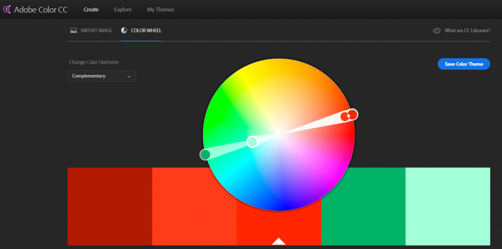
To find a color scheme that works use the color wheel and search for complementary colors (those that are opposites on the wheel) or analogous colors (those that are next to one another on the wheel).
Choosing best color schemes can make your website appear more interesting and can keep people on site long enough to make a positive buying decision.

Step 4: Format Persuasive Copy Properly
You should still know where the text should be placed for maximum conversions. A headline is dominant and should be placed center-stage on the home page so as to communicate the brand’s value proposition. Each following page should then contain a headline that speaks to the relevance of that page’s content.
Step 5: Be Clear About Outcome
The website that focuses on the action you want your visitor to take are highly converting.
Therefore best layout actually forces your visitors to walk through the process. Your calls-to-action should be prominently displayed so that they stick out and get noticed without much effort.
Whether you want your visitors to make a phone call, complete a form, or share your content over social media, your layout should act like a road map that leads visitors.
Step 6: Don’t Be Afraid to Borrow
Look at your competitor’s website and do good research work instead of reading about How to design a website layout.
You can copy your competitor’s website to be more predictive and intuitive.
Step 7: Go Responsive
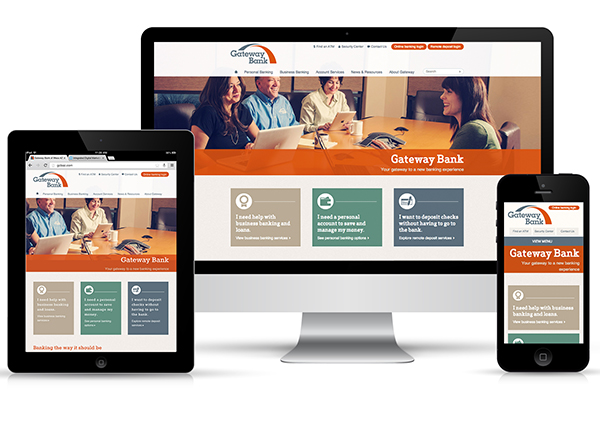
Most important thing is to make your website responsive. There is a high chance that visitor can bounce back if your website doesn’t work well on mobile or tablets.
Moreover, remove as much need to scroll and click and swipe as necessary. From PC to the tinniest screens of mobile visitors should enjoy the same experience.

Step 8: Feature Your Offerings & Smiling Faces
Aside from size and quality, the images you choose to comprise your site’s layout should be purposeful.
Study showed large and appealing images lead to high conversion rates.
Step 9: Strategically Place Trust Badges & Social Proof Elements
Visitors are always worried about sharing their personal information. Hence you need to build trust by adding trust badges and social media elements.
Trust badges include logos of popular brands that use your services or products. Examples of social proof can include client logos, feedback from satisfied clients, links to client case studies, and client story videos.
Step 10: Keep Testing!
Researching is necessary but still your audience will tell you what layout they liked the most.
Test every element of your site. The simple act of changing your call-to-action buttons could cause a major bump in signups or buys. Testing hence you learn a lot about your store.
You can even find what works for you and what not.
Conclusion
To summarize your website represents your brand therefore keep it simple yet attractive and professional to turn it into conversions.
If you feel like your website is not up to the mark, start making small amendments.
You should know your audience, their behavior, needs and expectancies, and built the appropriate message that molds perfectly on a layout. The layout will have the role to let the message be so convincing for the users.
Moreover, keep adding and testing elements to your website’s layout to make your site even more user-friendly.
Looking for the best website layout? Get a FREE Quote today.
